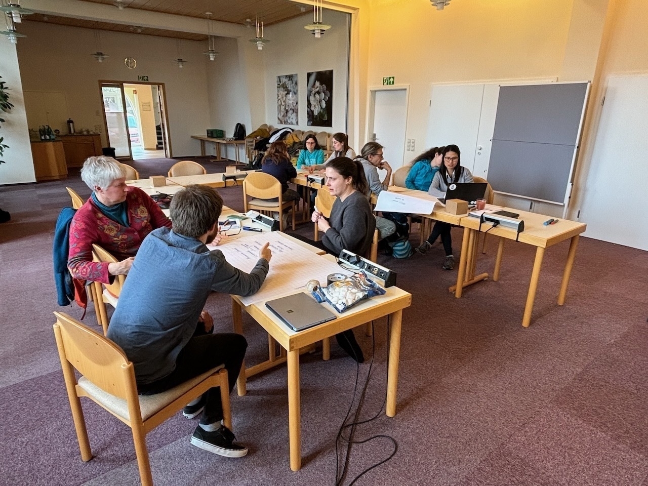
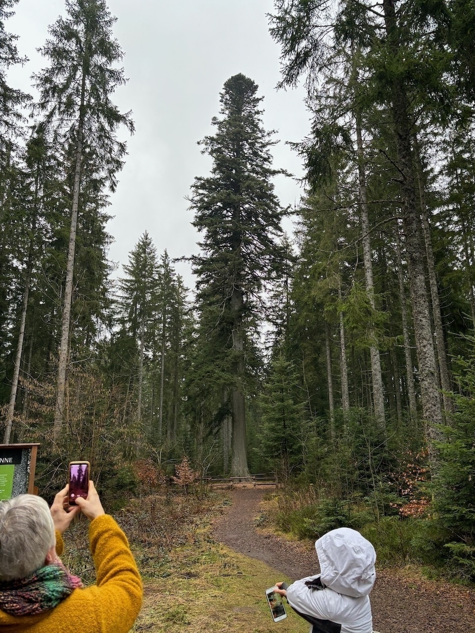
VEGAS Workshop
Last week we had our two-day @VegasIws@mathstodon.xyz workshop in the Black Forrest. We role-played group communication (the “NASA-exercise”), discussed research data management and publications as relevant for @VegasIws@mathstodon.xyz, dreamed up projects, ate, drank and experienced the firs of the Black Forrest!
We think, very useful for the team! 😉
Talks at EGU24
I’m happy to be able to give two presentations at the #EGU24 meeting in Vienna on Monday April 15, 2024
| Time | ID | Session | Title | Authors |
|---|---|---|---|---|
| 08:55–09:05 | EGU24-7899 | HS8.1.7 | Immobilization of Per- and Polyfluoroalkyl Substances (PFAS) – Experimental and Model-based Analysis of Leaching Behavior | Claus Haslauer, Thomas Bierbaum, Simon Kleinknecht, and Tobias Junginger |
| 15:25–15:35 | EGU24-7820 | HS3.9 | Data-driven surrogate-based Bayesian model calibration for predicting vadose zone temperatures in drinking water supply pipes | Ilja Kröker, Elisabeth Nißler, Sergey Oladyshkin, Wolfgang Nowak, and Claus Haslauer |
Looking forward to meet you in Vienna! The conference is in Vienna, Austria & Online | 14–19 April 2024
PFClean Project in the news
Our PFAS-remediation project “PFClean” is in the news today
– at U of Stuttgart news
– at LinkedIn of U of Stuttgart
New Water Blog “The Water Droplet”
Almost one year ago already, Steve Shikaze started a new blo, “The Water Droplet”.
Steve has a long career in hydrogeology, we “share” the same Phd-advisor, and he almost hired me once. I guess it’s fair to assume, I am biased in his favour.
Steadily, Steve is covering important hydrogeological issues such as land subsidence, groundwater recharge, PFAS / forever chemicals, groundwater management issues in California and in the south/central US.
Since you are already on this site, there is a good chance that you will be interested in The Water Droplet. So I encourage you to head over there!
Stones Turned This Week
Net News Wire
NetNewsWire 6 is now on the (iOS, iPadOS) AppStore!
Together with NetNewsWire 6 on macOS it is a wonderful open RSS solution, offers iCloud sync that works well (and makes me think about my long-time, by now beloved, but not mentioned on _DavidSmith’s blog in quite some time, Feed Wrangler subscription).
One feature that I use more than anticipated is NNW’s novel ability to subscribe to Twitter Accounts (even searches) like a feed. It’s not surprising given twitter’s gradual and steady deterioration of the timeline.
How else, other than NNW, do you keep track of RSS feeds?
Speaking of blogging, Macdrifter seems to back from his hiatus. What a nice polarity to twitter – few posts, a lot of content! Also, I completely stole the title of this post from him.
Marble Quarry
Admittedly, this video is another link from Jason Kotke, but it has a strong connection to fractured rock hydrogeology, and hence is relevant for this site. The combination of the visuals from the open pit mine with its bulldozers together with the audio from an opera, is more delightful than expected. Then again, I am not so sure what to expect from an ad for a quarry.
Trinkwasser in Deutschland — Mengenproblematik
Obwohl wir (in Stuttgart) bisher eher ein durchschnittlich nasses Jahr haben, werden die Rufe nach mangelnder Wasserverfügbarkeit lauter.

Dürreperioden: Wird in Franken das Trinkwasser knapp? – Nürnberg – nordbayern.de
Bundesamt für Bevölkerungsschutz warnt vor Trinkwasserknappheit
Thermally Enhanced Wall Vapour Extraction
It’s been awfully quiet around here. My delightful New Year’s resolutions are already in the can, and it’s only early March. As if there were not sufficient issues with a raging pandemic.
Maybe the picture below tells you a little bit about my state of mind. This is how my bedroom and office has been looking. Thermally enhanced wall vapour extraction. The person who built a wastewater pipe in the shape of a double-S (yes, literally) should be ashamed for a long time.

Too Many Meetings
It’s mid-January. I had great New Year’s resolutions. I have already downgraded to “blog more”. Brian Romans started what he calls “friday links” on twitter. Let’s say that I aim for something similar, but here on my blog. Which I have been neglecting. Starting to write again on a blog that has been neglected, is in style.
The thing that has been bothering me substantially before Christmas: too many meetings. To some extent, the “too many meetings” problem has been going on before Corona. At the early times of Corona (Spring 2020), there might have been actually less meetings. Currently, the situation seems as bad as it has ever been. One Webex or Zoom, meeting after meeting. It’s difficult to find time to get anything done. This has become very clear over the Christmas holidays.
This article (via Rui Carmo) gets many things right. This I found particularly interesting:
It’s even worse when a worker has several meetings that are separated by 30 minutes. “Not enough time to transition in a non-MRS situation to get anything done, and in an MRS situation, not quite enough time to recover for the next meeting,”
One remedy sounds simple but I am not sure how to achieve this: less meetings
Less time in meetings would ultimately lead to more employee engagement in the meetings they do attend, which experts agree is a proven remedy for future cases of MRS.
So, “just” saying “no” more often!(?) Maybe more tools and automation? Maybe this high – profile advice will help me to decide if I should accept a meeting. Also important: he emphasises that everybody should be prepared, everybody should speak. Breaks sometimes are no real breaks but are giving your brain time to digest thoughts. Even more, breaks are always necessary. And: everything is uncertain!
It is one thing to realise that everything is uncertain, but as @dougmcneall points out:
Making constant risk decisions is exhausting.
This brings us to Corona. During which the usual exhausted-ness seems to be amplified, e.g., with sub-optimal working conditions, and with kids at home. Like Hayley Fowler points out: I’m just tired of everything. Like Brent Simmons point outs:
“I’ve been haunted since hearing, in the early days of the pandemic, that if we all wore masks for six weeks this thing would be over. I was there. I’ve done that for six weeks, and another six weeks, and another. And now it’s worse than ever. It’s a challenge not to be angry. There are healthy, uninfected people right now, today, who are excited for the vaccine and who will die before they get it.
Teaching Experiences
webex (which we use at the University of Stuttgart), has now the ability to share the iPad’s screen! It might have been there before, but I realised it existed only on Monday. Before, I knew that zoom can do it. Anyways, this has proven to be a nice tool for teaching sequentially and more spontaneously than an animated slideshow.
I’ve upgraded to JupyterLab 3 with it’s visual debugger. Very nice, also for teaching! This ranked list of awesome Jupyter Notebook, Hub and Lab projects (extensions, kernels, tools), that is updated weekly, provides also very many useful hints!
Ending
France and Switzerland have a great free data policy
I re-built an old Dell Latitude 6410 with Ubuntu 20.10 – and it works great (except for the screen after sleeping). But it has been serving us (and my kid) great for instructional videos and moodle!
With Input from
- Brian Romans ?? (@clasticdetritus) / Twitter
- Don Melton (@donmelton) / Twitter
- Rui Carmo (@rcarmo) / Twitter
- Dr Doug McNeall (@dougmcneall) / Twitter
- Prof Hayley J. Fowler (@HayleyJFowler) / Twitter
- Barack Obama (@BarackObama) / Twitter
- Brent Simmons (@brentsimmons) / Twitter
- Massimiliano Zappa (@Hydrology_WSL) / Twitter
Pickup Basketball
Life under COVID is all organized virtual play dates and no unexpected pickup basketball.
I’ve never played much basketball, but there was always a game of soccer going on on the streets or on the field in the neighbourhood where I grew up. I’ve never even considered that as “important”. Still, Peter’s statement resonates very well with me. It’s likely the same reason why I miss having a “break” with colleagues.
What can we do about it? How can we keep up with colleagues as easily?
This won’t solve everything. In an attempt to at least get out more (turns out, sitting in front of a computer all day does not make me more productive, d’oh), I followed Sina Trinkwalder’s motivation #lockdownlaufen #movemeber.

Adventskalender
Can you have too many Advent Calendars? — I don’t think so!
Here is a wonderful python related one!

PS: I already needed help from wtfpython
PPS: A colleague recommended this… interesting…
def (a, b=None):
    if b is None or a / b < 0:
        return a
return a / bYay to Automation on the Mac
Generally, I am more happy about automating things on the mac than on windows. Being positively minded, there are even some novel sparks in the automation-scene: there is a relatively new podcast, there is hype as a popular image-app just added Apple Script support. Sounds svelte. Note that Apple Script has been around for quite some time.
In a efflorescence of presumption I wanted to export an image from the Photo.App using the time-stamp of the date it was taken as the start of the filename. Something I do regularly with Matplotlib images from python. I’m not the expert, but it seems to me that this is not possible directly from within Apple Script! — Please please tell me that I am wrong and demonstrate me that it is in fact possible!
Nevertheless, I hacked (there should be a word with even more negative connotation) together the most horrible thing I ever done, using Keyboard Maestro. As they say, there is nothing better than a good previsionary arrangement.
Now I can do this:
- select an image in Photos.App
- the date the photo was taken in ISO format is the start of the filename. However, as this is not directly possible, it is passt to a KM variable
- the photo is exported into a folder of my choosing
- a Finder prompt asks me to select this photo
- another prompt asks me to enter the description part that is appended to the ISO-string
- a html-string for an image (using the correct file name) is put into the clipboard that I can use in my writing app of choice
Hopefully I remember what I did in a couple of days…
